Menus:
Simplified 简体
|
Traditional 繁體
August 2, 2015

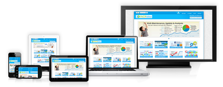
More and more people use smartphones and tablets these days. Some time ago we improved the support for tablets by moving the menu from the left side to the top of the screen. For smartphone users we introduced a mobile version of the MDBG website, it lacked many of the features that our users love about the MDBG website however.
From now on smartphone users can also enjoy all the features of the MDBG website. We modified the MDBG website to automatically adjust the presentation, removing unnecessary parts and reducing the size of other parts of the page according to the size of the device. Additionally we increased the size of buttons and input fields to accomodate for touch screen usage.
Most of the functionality should work on smartphones with 4" or larger screens. Some functionality might still require a little panning left and right, but the majority of the information should be displayed without panning. You can also rotate your smartphone 90 degrees to increase the width of your screen.
Just use the same URL to open the MDBG website on you mobile device: www.mdbg.net
Additionally we also improved the new handwriting recognition panel released several months ago, improving the accuracy of character recognition.
Happy searching, happy learning! :-)